.
This summer, we’ve shined a light on some of the biggest literary brands and discovered just how often an author’s own personal brand is deeply embedded in their work. In this guest post, we see an extraordinary example of just that. Author Emma Champion shares the journey behind branding her trilogy, which was born out of a lifetime of various influences and inspiration. Here she talks about her the collection of deeply personal experiences and the passion that shaped the iconography of her book Taiden’s Truth, and how it proved to be an intimate reflection of her own personal brand.
Here’s Emma:
In the corporate world, when applying for jobs, people are advised to think of themselves as a ‘brand’; to market themselves like a desirable product. Throughout my career, I’ve noticed that some people have even created their own, personal logos, which they put on their CVs.
Whilst, to some, this might seem like overkill, it’s actually rather clever. If your resumé is one of several on the consideration pile, you want to stand out amongst the standard, monochrome bullet-point lists. Just like any other piece of written text, you want to draw your reader in, spark interest, create intrigue. Like the cover of a book, it has to give an impression of the content, and appeal to its audience.
They do say never to judge a book by its cover, but we all do it. The cover depicts the brand of the book or book series.
Being a bit of a movie geek, I tend to think in terms of film. Movie franchises such as Harry Potter, The Twilight Saga and The Hunger Games all have their own unique visuals – familiar title fonts, characteristic colours and symbols. With just a passing glimpse, their identities are subliminal. Even if it’s in another language – you see it, you recognise it, and you know what it is.
That is what I set out to achieve with my own book series, The TAIDEN Trilogy. The cover is the first port of call in terms of book promotion. It’s the poster for your ‘movie’, illustrating the brand of your ‘franchise’. For those reasons, I wanted a symbol – a trademark – that people could see and instantly connect with. Additionally, I wanted it to come from a place deep within myself, just as the story itself had done. And so, I began to build my ‘brand’.
The Beatrix Potter Effect
I always had a clear picture in my head of what my novel was going to be. In terms of the story, sure – I’ve always known the story of the full trilogy (yes, Folks – I know how it ends); but also, in terms of designing the overall image of the Taiden books. I sought to conceive something that would be instantly recognisable at a glance. For that, I knew I had to come up with something enduring and iconic; but where does one start in conjuring such things?
First, I turned to my all-time literary heroine, Beatrix Potter. Okay, I don’t write illustrated, children’s story books. However, she and I share similar traits in terms of our creative vision. For example, when she was finally granted a publishing contract with Frederick Warne & Co. in 1902, she was adamant that the books be a particular size, and that the illustrations appear in black and white. She even mocked up a sample, hand-binding it to show them what she wanted.
Luckily for all of us, the Warnes managed to persuade Ms. Potter to have some of the pictures printed in colour. However, the point is, she had a distinct vision, not only of the story she wanted to tell, but of how the book would look on a shelf and feel in the little hands of her young readers.
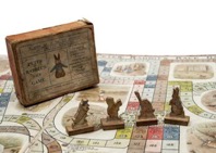
Photo: an antique edition of ‘Peter Rabbit’s Race Game’.
Potter also had a clear understanding of her ‘brand’ and how she wanted to promote it. She pioneered plush toys of her characters and illustrated board games that children could play based on her stories. That kind of merchandising was a very new concept in the early twentieth century. With a history in the field of marketing myself, I completely connect to Potter’s mindset. I, myself, had a Taiden T-shirt made as an experiment in merchandising.
Sources of Inspiration
Similar to Beatrix. I could see my book’s cover as clear as a photograph in my mind. I envisioned dark green, grained leather, with a symbol embossed into the surface, and bold, gold lettering. This was inspired by Beatrix Potter’s own journals (an homage, of sorts, to my hero), as well as a beloved copy of Black Beauty that my Dad bought me when I was twelve years old, on the day I met my new-born brother, Terrence, for the first time.

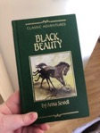
Left: Emma Champion’s personal copy of Beatrix Potter’s Journals. Right: Emma’s childhood copy of Black Beauty, that her father bought her when she was twelve.
I did appreciate that the likelihood of a real leather cover was perhaps a bit too ambitious for a first edition, not to mention a first-time author. So, I settled upon the idea of creating the illusion of embossed leather. If gold foil lettering was not possible, I’d opt for yellow instead. Compromise.
Taking a leaf out of Beatrix’s book, when I completed the first draft of my manuscript, I physically bound a hardcopy for myself as both an editing tool and an exercise in visualisation. I made a cover out of green, leather-effect cardboard, and used gold alphabet stickers to spell out the title. Seeing it as a real, physical entity made it real. If the Law of Attraction is to be believed, visualising your goals helps to manifest them. That moment was an important one. I will reveal why later.
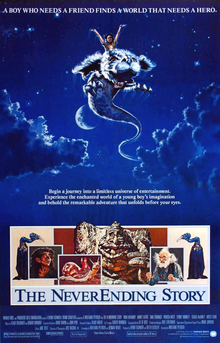
Poster for The NeverEnding Story (1984)
In terms of imagery, I was inspired by fantasy movies from my childhood featuring old books that became catalysts for adventures in other worlds. Films such as The NeverEnding Story (1984), Labyrinth (1986) and The Princess Bride (1987). I wanted the Taiden books to have that same air of mystery and a suggestion of history about them.
Also, for the Taiden symbol, I always loved the logo for the musical Les Misérables– little Cosette, looking windswept and forlorn. That is a great example of a brand that needs no title to explain what it is. Like Cosette,
the character of Taiden is tinged with tragedy. The sombre nature of that famous illustration lends itself well to Taiden’s tone.
And then, I remembered: my drawings.
Signs from the Universe
Over a period of about 20 years overlapping the writing of Taiden, I had sketched the same girl, over and over. Whether aimlessly doodling or purposefully sitting down to make art, she emerged on the page, again and again. Calling her simply, ‘The Girl’, I thought nothing of it, outside of the fact that it was a bit weird. That was, until I came to really think about the cover of my book.
You see, the idea for the story of Taiden itself came from a dream. Not a daydream or a conscious goal – an actual, sleeping dream. So too had these drawings come to be – an automatic symptom of unconscious thought. In that sense, and, being as I’m quite spiritual by nature, I took the first as a call-to-action from the universe. Eventually, I realised that the second was the same, and related to the same subject. At last, I’d solved the mystery: The Girl was Taiden, and the drawings were another nudge from the ether to tell the story.
I looked back through my sketches, as I’d kept them all. Though most had been scribbled with biro on scraps of paper, one had been the first drawing I’d made using a digital drawing tablet ten years earlier. It had that ‘Cosette’ quality to it – windswept, sombre tragedy with a hint of mystery. I knew this was the one– the drawing I’d use as my logo – my brand.
I used design software to modify the drawing, extracting elements from it to produce a more abstract look; and then a series of effects to create the illusion of embossing. The result turned my drawing into this gnarled, edgy image that I immediately fell in love with.
Placed on top of a grained leather-style background, and with the addition of a bold, golden font inspired by some of my favourite book covers, I had the cover design completed. My brand was born out of a variety of sources that spanned my entire lifetime. It felt as though the stars had aligned; like the universe had put things in my path and sent me ideas my whole life that would lead to the manifestation of this story and its imagery.
As to the moment I bound the infamous ‘Working Copy’ of my manuscript, it proved the power of visualisation. The week before my book was published, I received a box of special-edition paperbacks, featuring gold foil lettering on the cover. Only twenty-five of them exist – the rest feature the font in dark-yellow. But, when you compare the book I bound with the first printed copies, they are eerily similar.


Left: The ‘Working’ Copy – a hand-bound version of the 1st draft manuscript made by Emma.
Right: Emma holding up one of the 25 Special Edition Gold Foil editions of Taiden’s Truth in Paperback.
This is what happens when you take a thought and turn it into truth. Building a brand from the ground up is exactly that. That moment when it stops being a vision in your head and becomes something tangible you can see, and touch, is truly remarkable.
Summary
For all I know, at this early stage of publication, my book might fade into obscurity, fated only to be discovered by a handful of people. Or, it might prove to be incredibly popular. Who knows? All I am certain of, is that I was born to create it. I am filled with an overwhelming feeling of purpose, and the surest sense of self I have ever experienced. That is how I know I am on the right path for me. Something kept willing me to see this project through. It was the idea that never went away, that constantly called to me. My vision. My dream.
That is what every brand is – someone’s vision of the future; their ambition, their determination, and that feeling that if they don’t do it, they might burst, or something. Birthing a brand, when done from the heart, has a flavour of destiny to it. The look of the Taiden books is based on a collection of deeply-personal symbols of meaning from my own life. Look to your own story for inspiration, and let it whisper the answers to you. When you do, you might just realise that the solutions you’ve been seeking have been hiding in plain sight all along. Life leaves little clues for you to solve. Eventually, you figure out what it all means in the grand scheme.
That thing that lights up your soul – THAT’S your path. Your destiny. If you can dream it, you can do it. Take it from someone who knows.
*******************************
Follow The TAIDEN Trilogy on social media, including Facebook and Twitter.
Taiden’s Truth is out now and available from the following retailers: Amazon UK, Waterstones and WH Smith
![]()